A®
2021
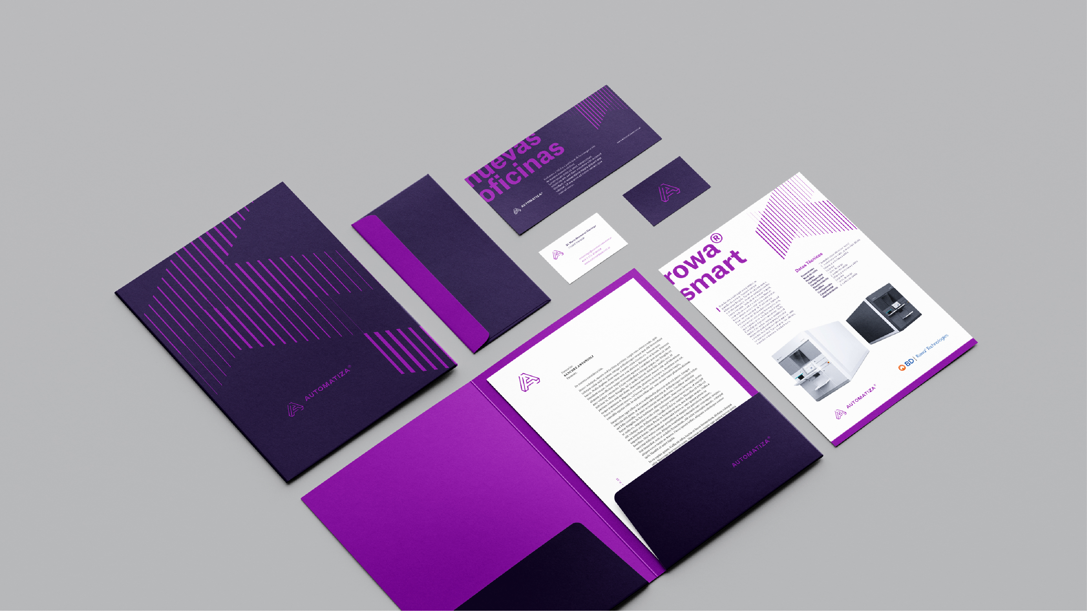
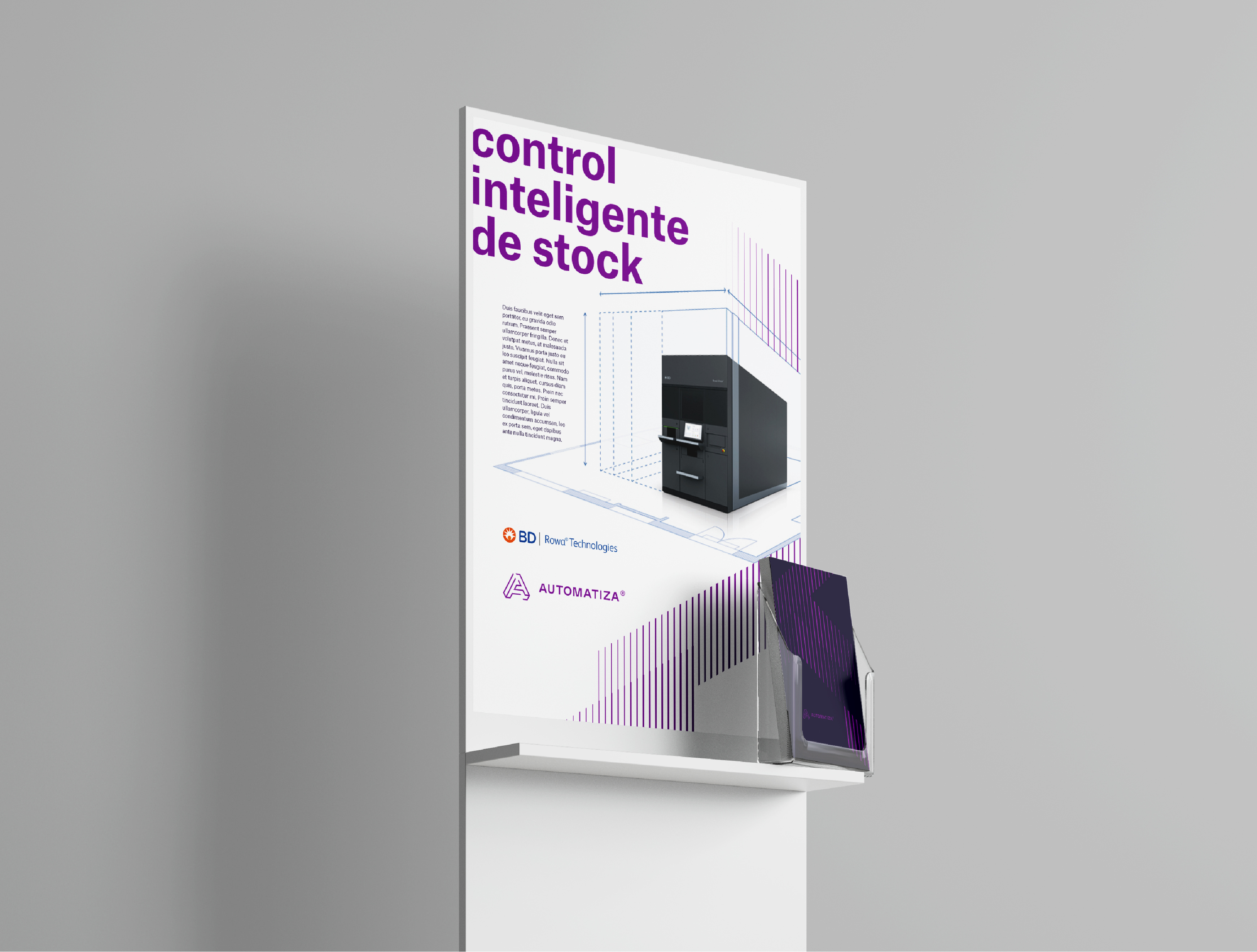
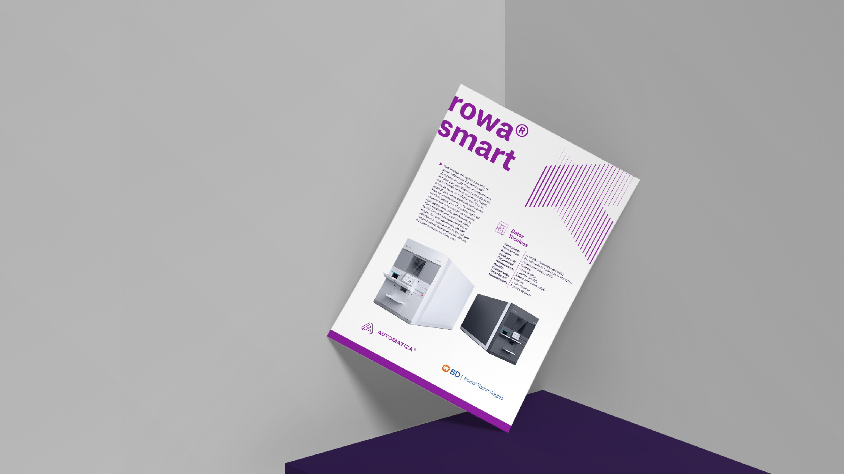
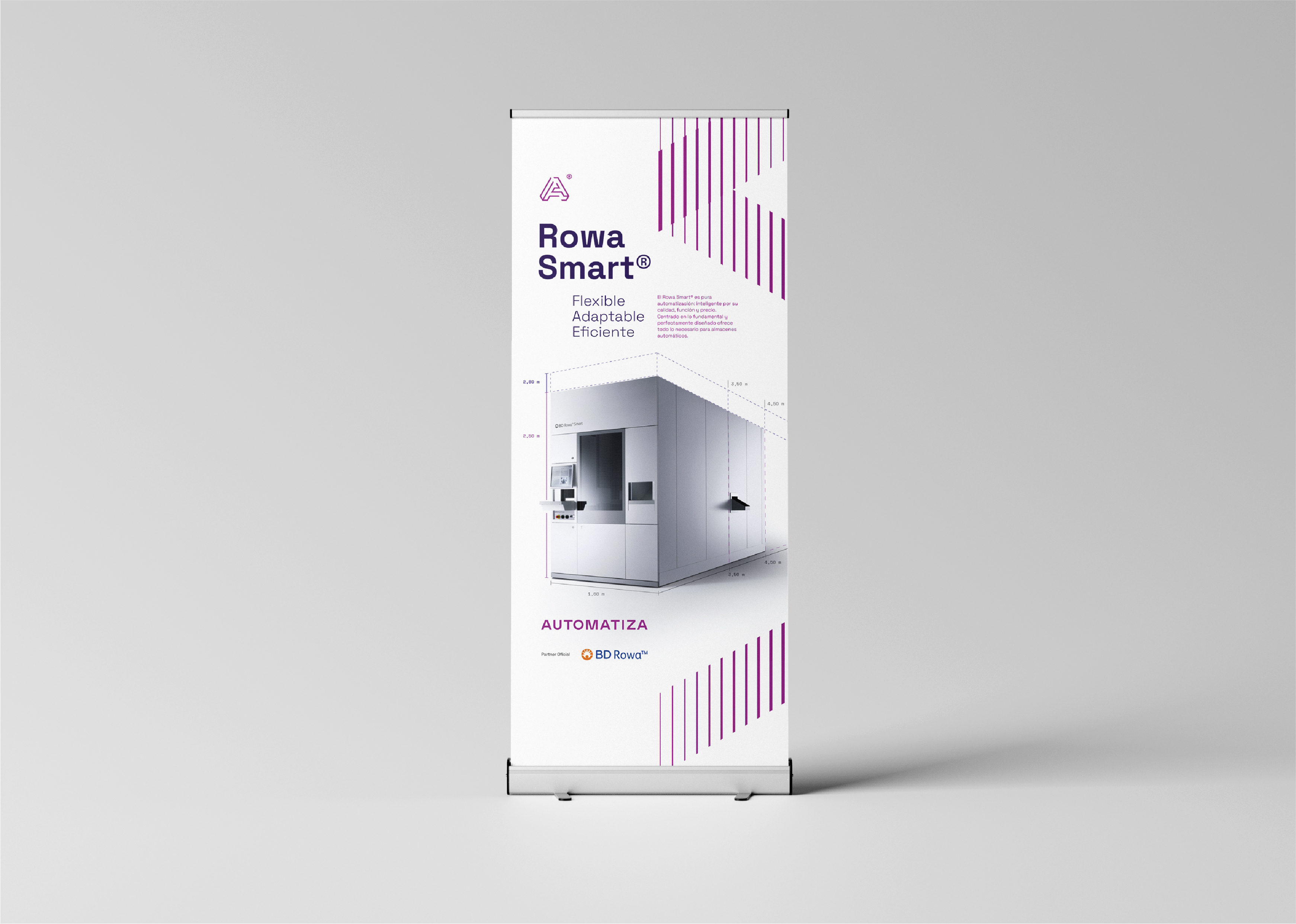
Automatiza brinda soluciones de automatización mediante la instalación de robots (fabricados en Alemania) que facilitan el control y administración del stock en farmacias y droguerías.
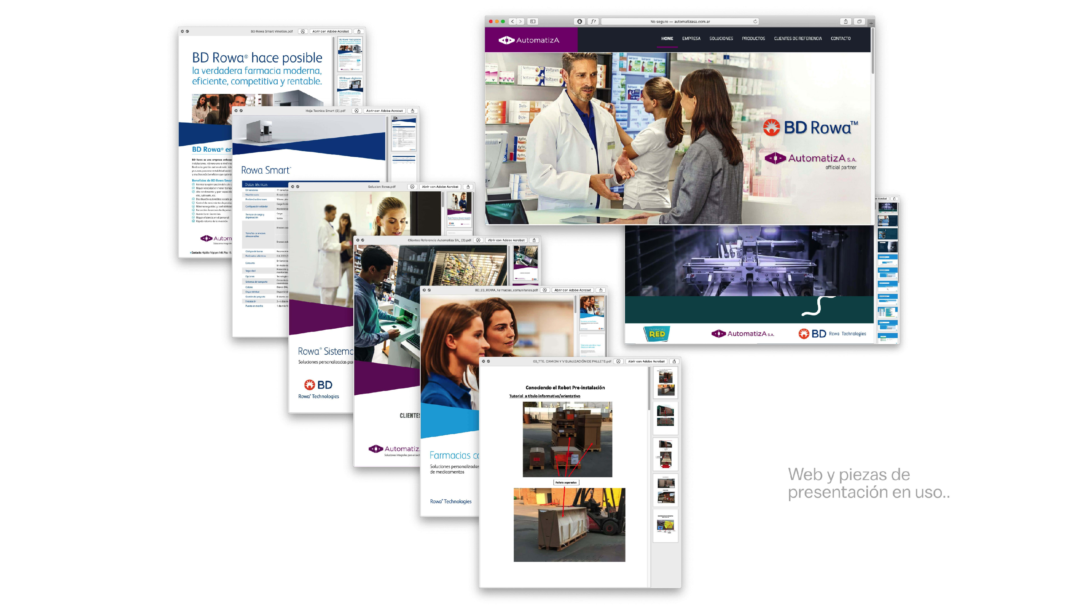
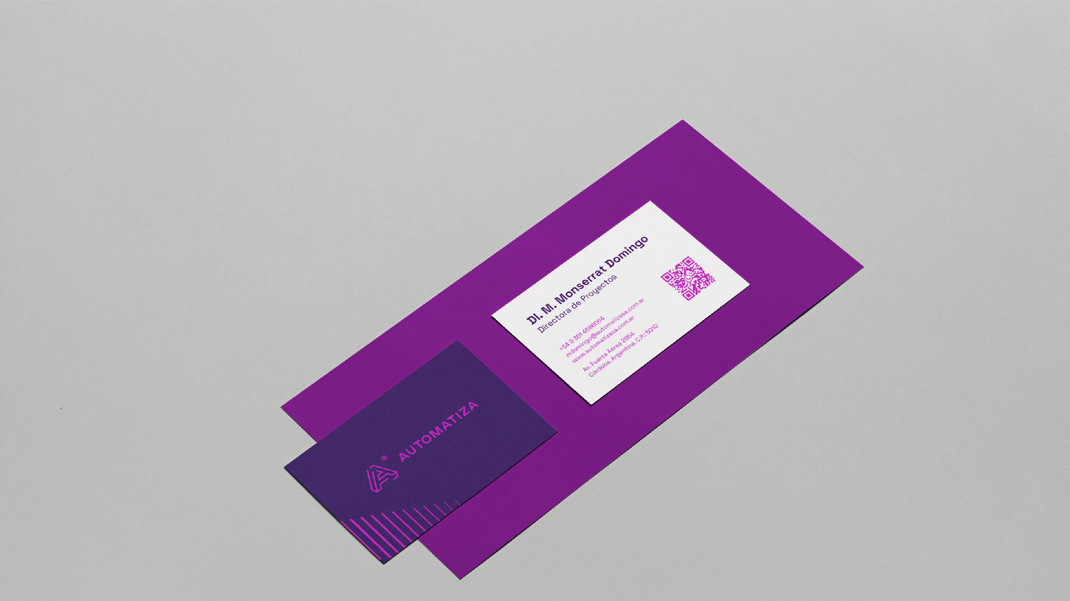
Nuestra trabajo fue ejecutar un rediseño de marca. El mismo comenzó con un diagnóstico de la marca gráfica y de todos los soportes comunicacionales (folletos, brochures, webs, etc.).
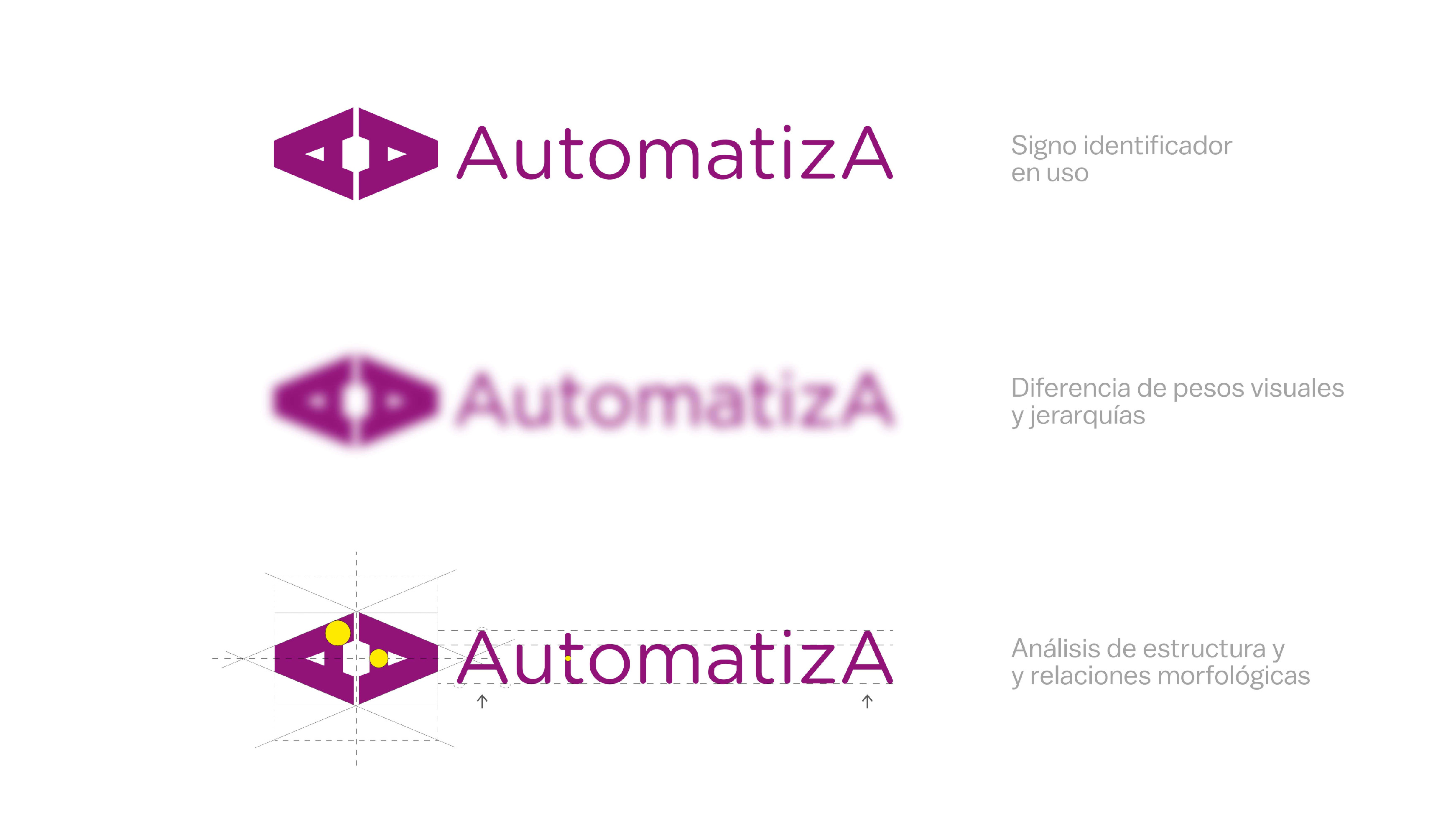
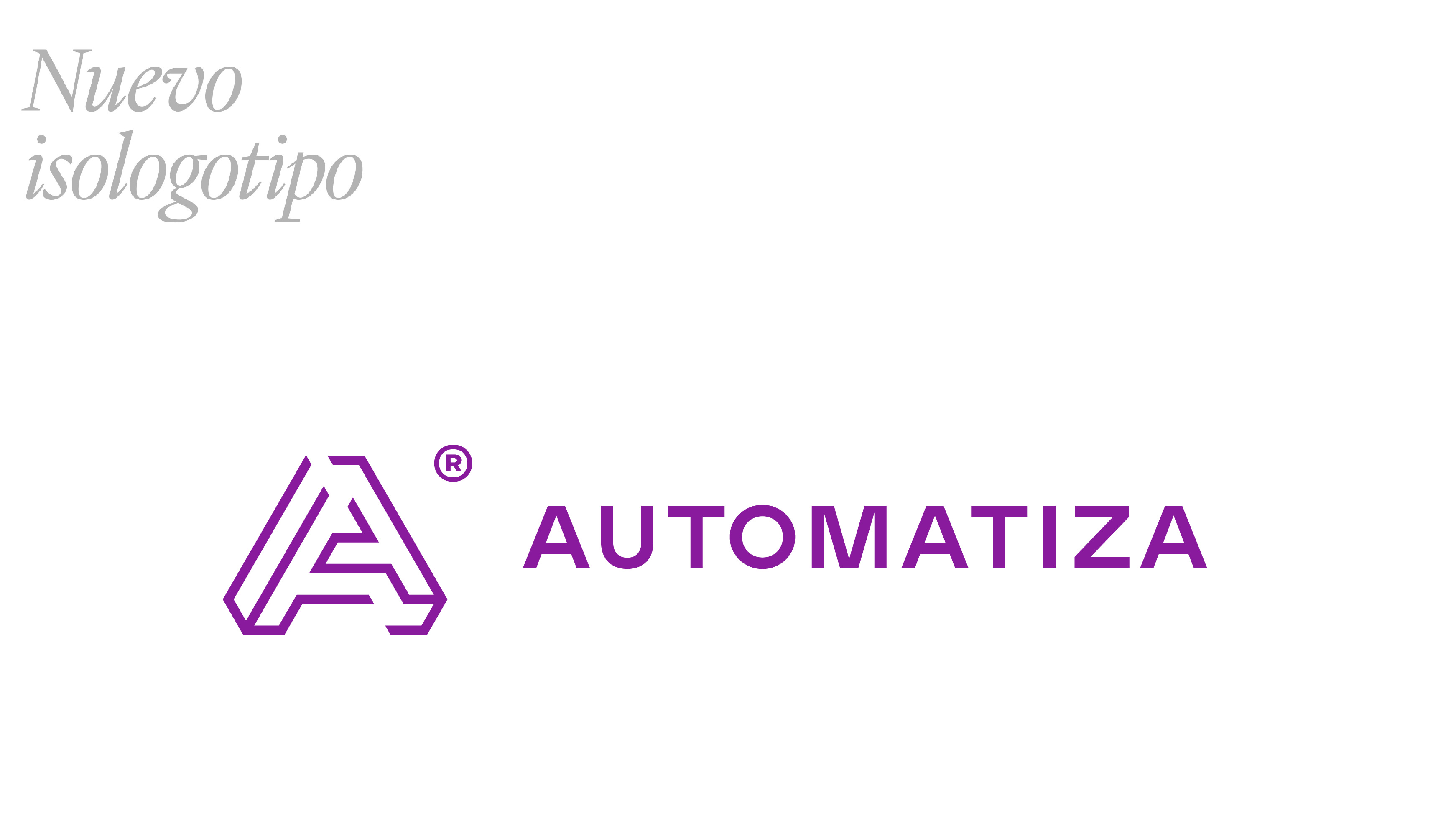
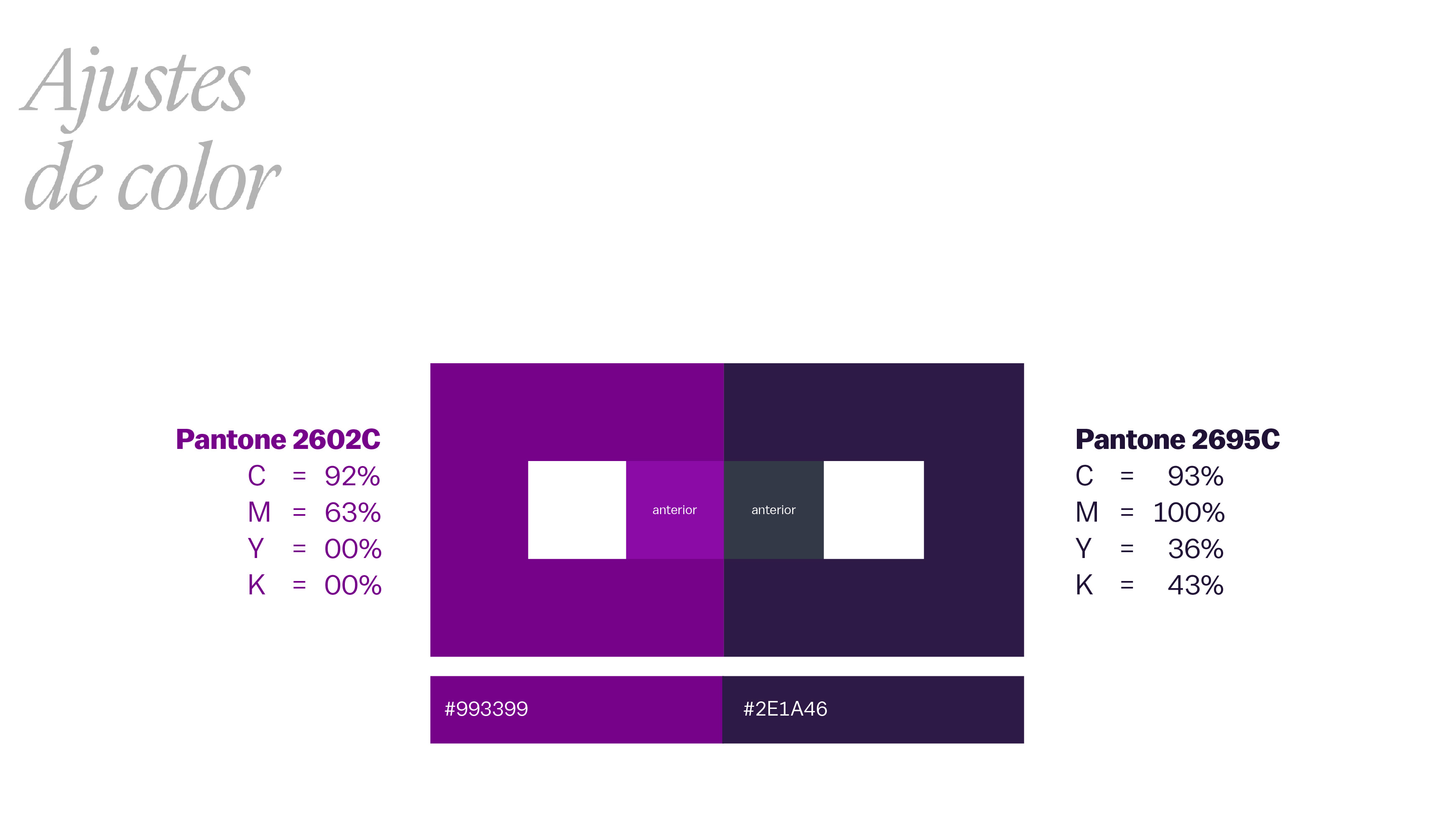
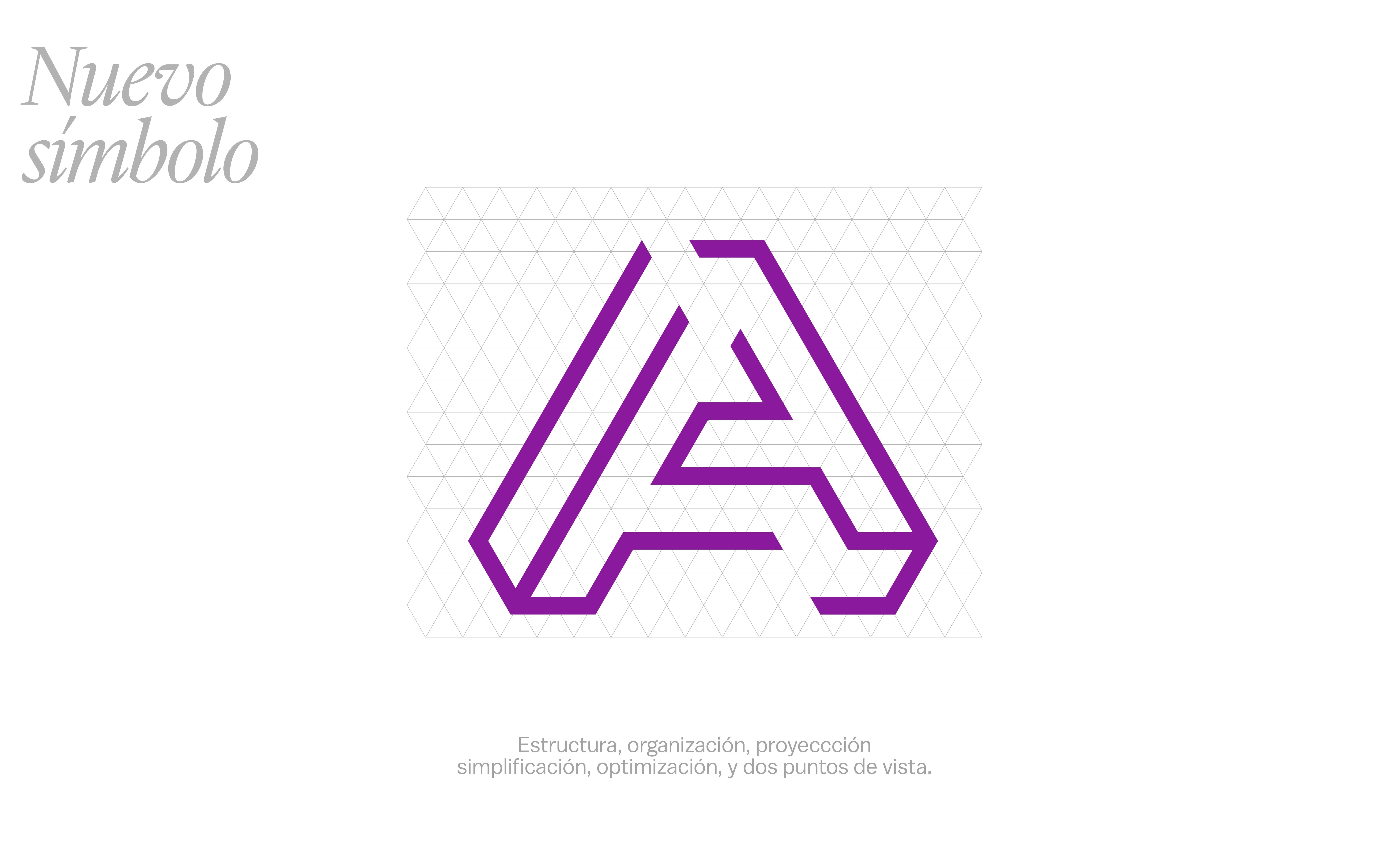
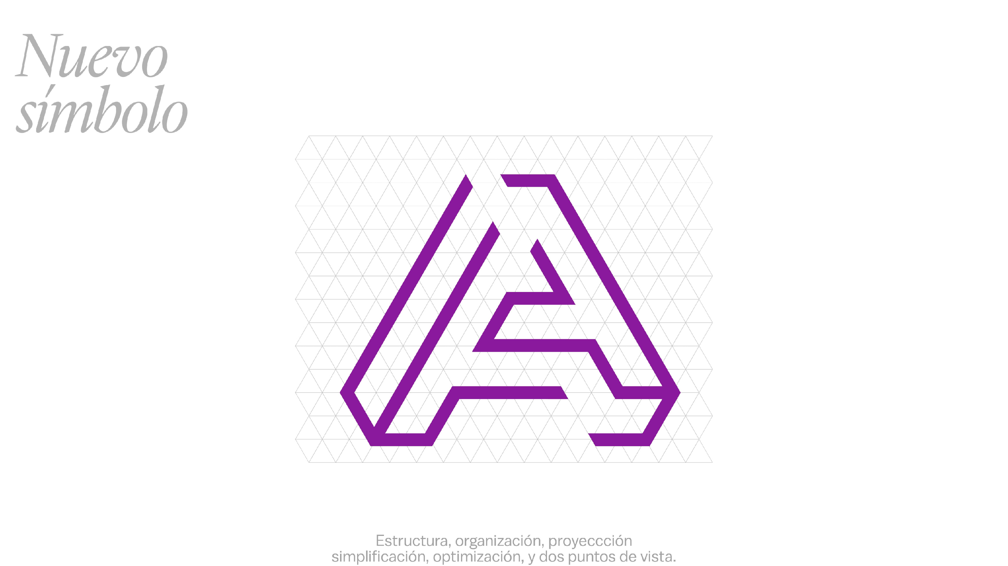
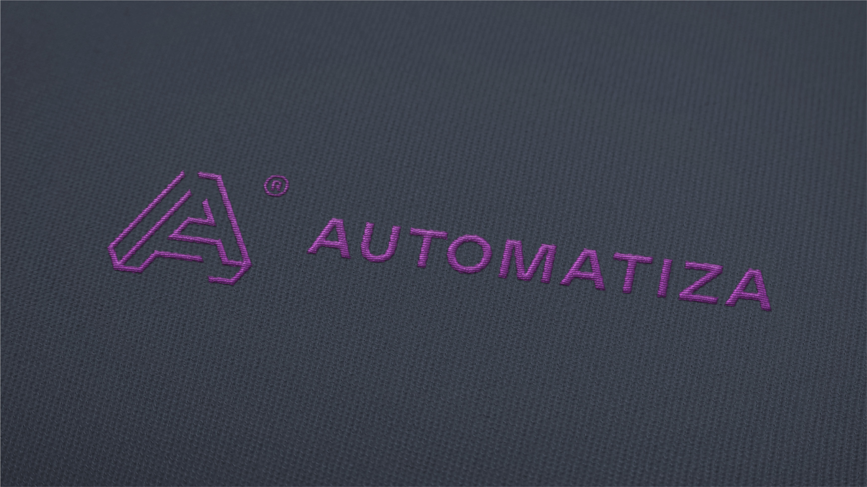
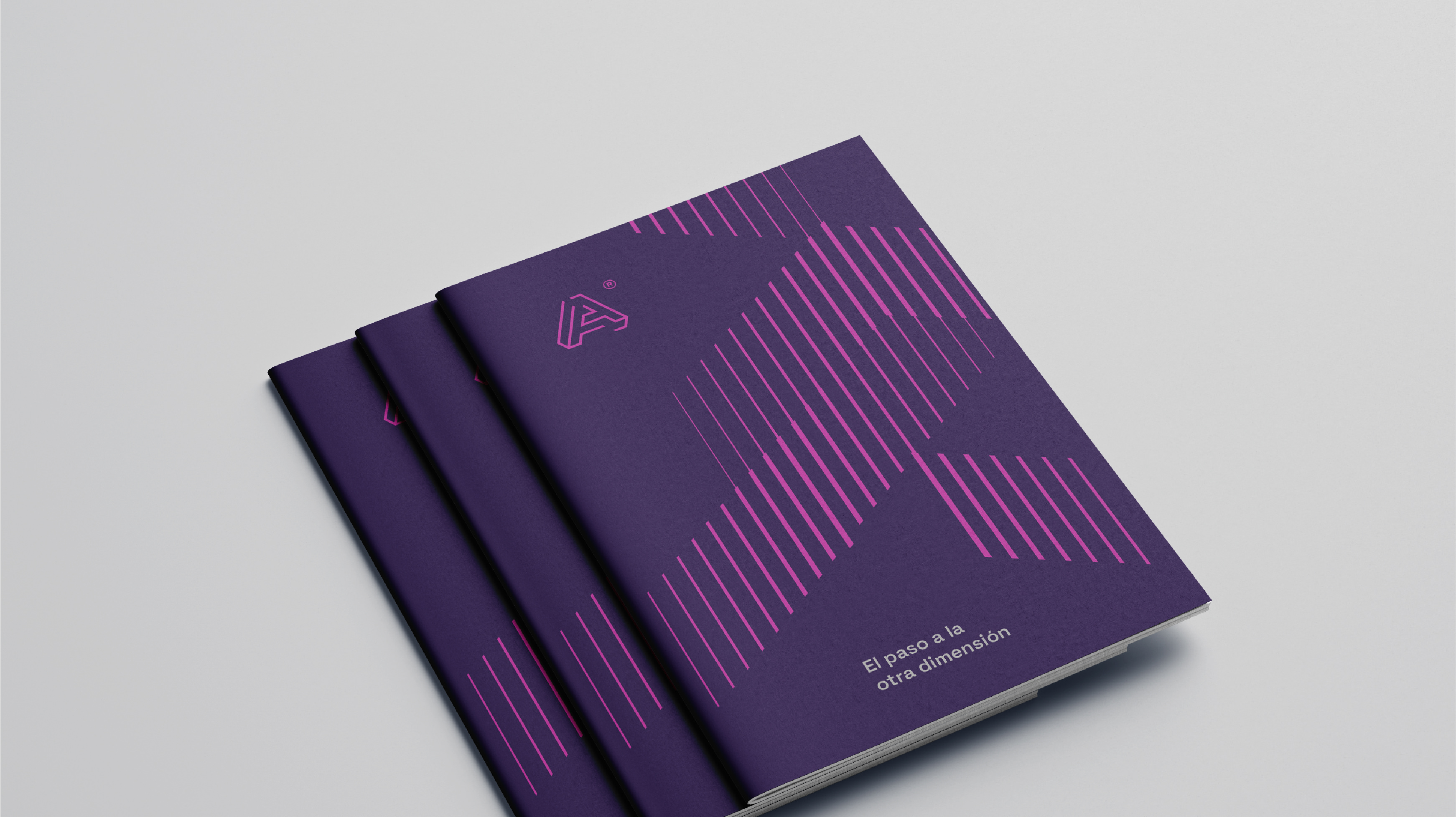
La marca, vigente hasta ese momento, presentaba algunos problemas técnicos en su relación logo (monograma) + texto, sus pesos visuales y la selección de las formas tipográficas. Existía una buena idea de representación pero quizás poco clara en la repetición de las letras "A", podríamos decir dificultades en la relación de representación y abstracción.
También, al ser Automatiza representante de una empresa alemana, la marca se veía gráficamente muy emparentada con ésta.
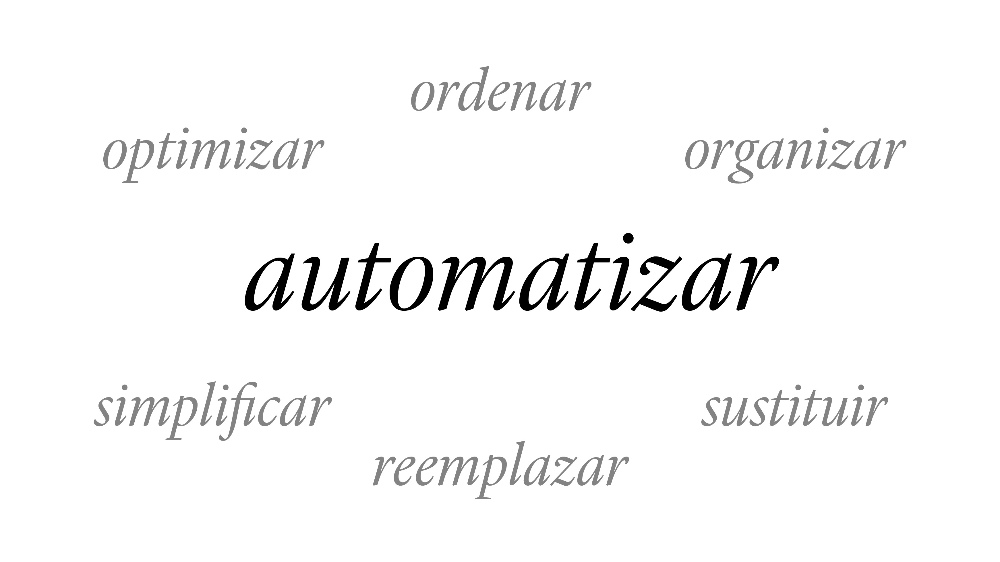
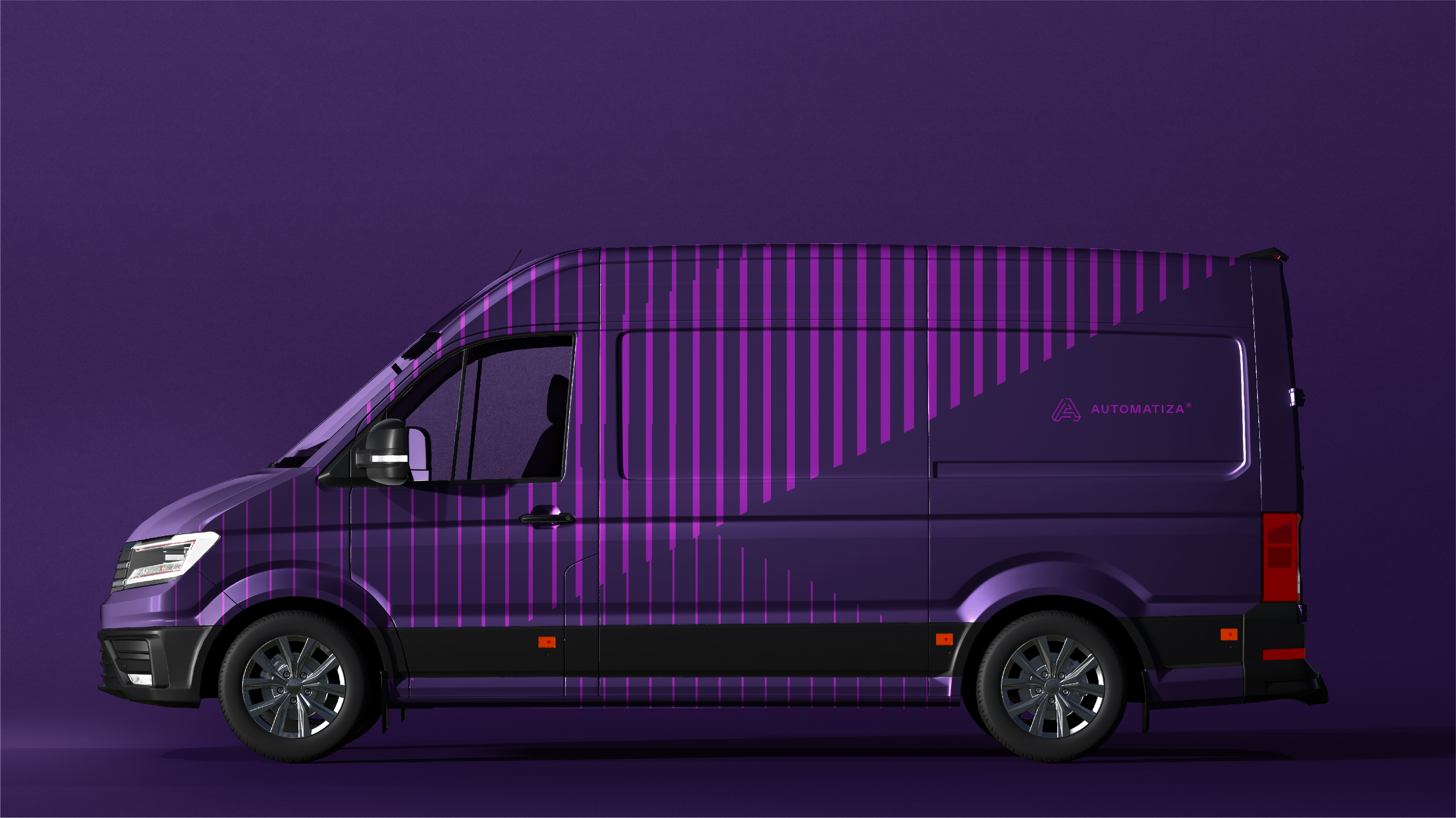
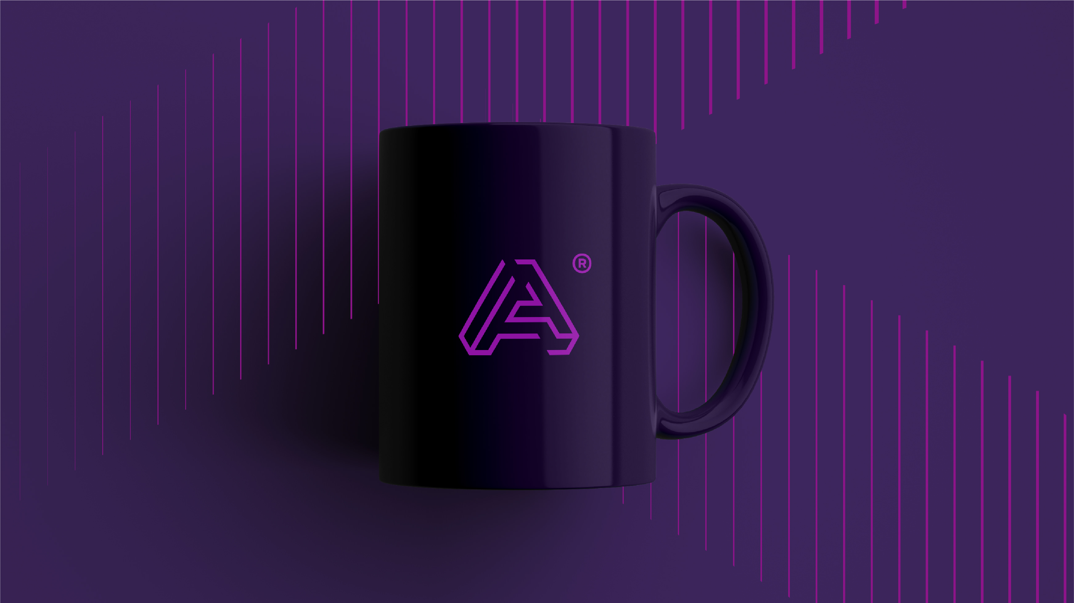
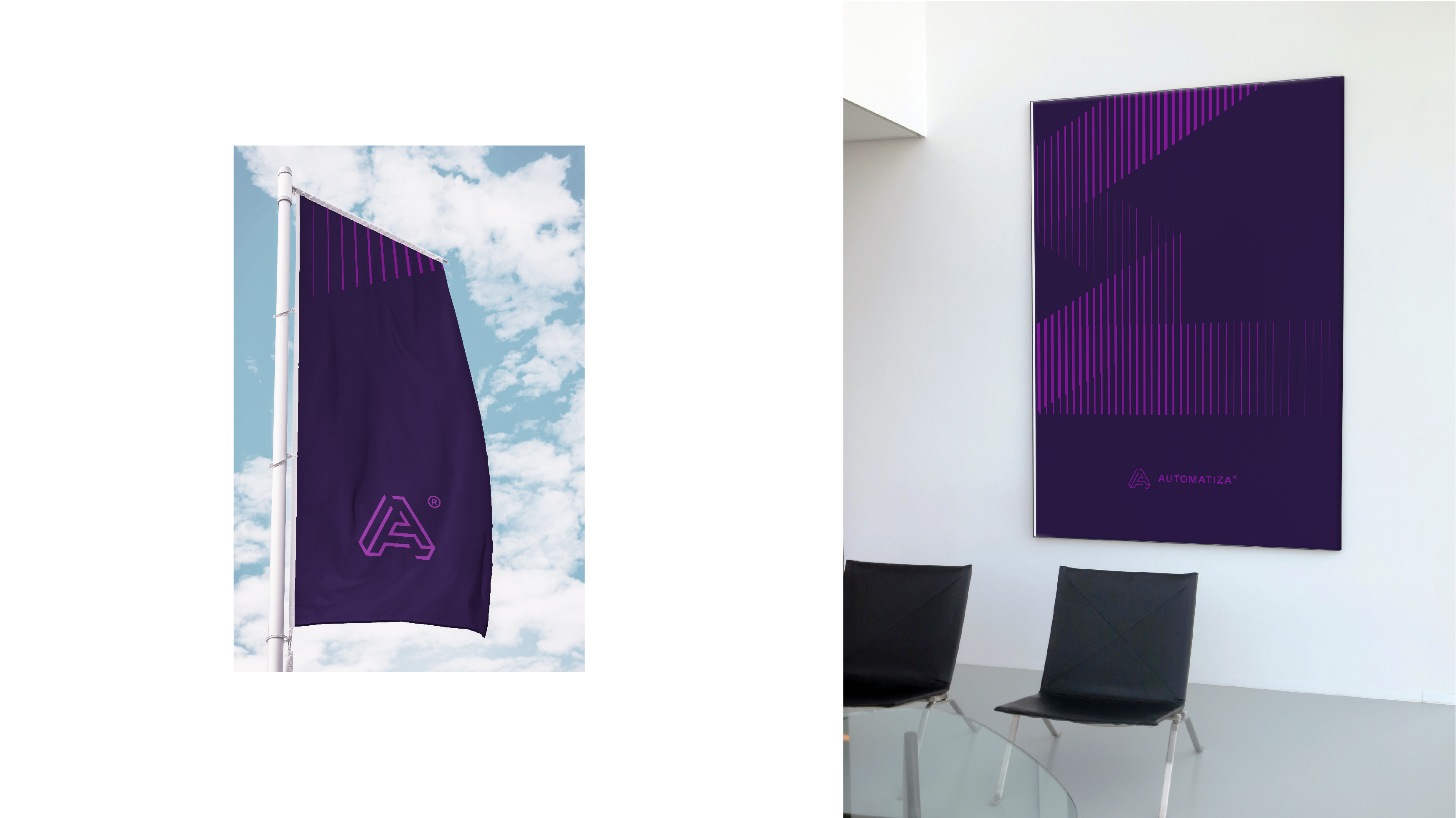
Los objetivos planteados fueron: (re)Diseñar/proyectar un logotipo con símbolo tomando en cuenta la idea actual como plan de acción, sobre todo por tratarse de una actualización. Gráficamente, conseguir la tridimensión sin abandonar la bi-dimensión. Y representar optimización, organización y simplificación.
Formaron parte e hicieron prosible también este proyecto: Mauro Ricci en coordinación y motion graphics (@mauro.ricci), Soledad Bossio en motion graphics (@ese.estudio) y Carolina Menso (www.id-idear.com.ar).
—
Automatiza provides automation solutions through the installation of robots (manufactured in Germany) that streamline stock control and management in pharmacies and drugstores. Our work involved executing a brand redesign. It began with an assessment of the visual brand identity and all communication materials (brochures, flyers, websites, etc.).
The existing brand, up until that point, had certain technical issues in the relationship between the logo (monogram) and the text, its visual weights, and the selection of typographic forms. While there was a solid idea of representation, there seemed to be some ambiguity in the repetition of the letter "A," indicating challenges in the balance between representation and abstraction. Additionally, as Automatiza was a representative of a German company, the brand appeared graphically aligned with it.
The objectives set were to (re)design/project a logo with a symbol, taking into account the current concept as an action plan, especially considering it was an update. Graphically, the aim was to achieve a three-dimensional effect while retaining a two-dimensional essence. The goal was to represent optimization, organization, and simplification.
Contributors who played a role and made this project possible included Mauro Ricci in coordination and motion graphics (@mauro.ricci), Soledad Bossio in motion graphics (@ese.estudio), and Carolina Menso (www.id-idear.com.ar).